Project NOAH, Revamped!
This project required me to design the overall UI/UX and lead the development of the website revamp.
My work was a balancing act between creating an interface that was usable for persons comfortable with complexity and those who are not, while at the same time ensuring the technical feasibility of my designs.
- Figma, Interaction Design
- Angular, Typescript, RxJS
- Mapbox
Project Background
The Philippines is a hotbed of disasters.
Located along the typhoon belt in the Pacific, our country experiences an average of 20 typhoons every year. Being situated in the Pacific Ring of Fire also makes our country vulnerable to frequent earthquakes and volcanic eruptions. We experience some of the most devastating of typhoons ever recorded (Typhoons Yolanda/Haiyan, Pablo/Bopha, among others) claiming thousands of lives at their wake.
In 2012, Project NOAH was launched as a research program under DOST (Department of Science and Technology) as a response to the late Philippine President Aquino's call for a scientific and data-driven efforts to monitor and assess potential natural hazards even before they happen. It has since then been a significant step forward in improving the country's disaster risk reduction and management capabilities.
In 2017, the University of the Philippines adopted Project NOAH and now falls under the Office of the President in UP. Specifically, the UP Resilience Institute, with Dr. Mahar Lagmay as the executive director, continue to maintain the project to date.
In 2021, I worked with the UPRI Core WebGIS team in rebuilding NOAH's frontend web app to focus on usability and modern technologies.
Demo Preview
The following video is our entry at Pista ng Mapa 2021, where I've had the honor of presenting our work on the revamped NOAH website:
Implementation Details
This was such a huge adventure for me and read on to know more about the process we've taken to accomplish this.
1 - Goals and Objectives
The revamp process started with identifying the goals of the project. Through a stakeholder questionnaire, we gathered information on why we are doing the revamp, what's our definition of done, who's our intended audience. Who wants the revamp anyway?
Together with the UPRI Core WebGIS team, the stakeholder being interviewed at the time was UP NOAH's Executive Director, Dr. Mahar Lagmay, and here's what can be concluded from the interview:
- Inform the lay person of the hazard exposure in their area, regardless of their expertise in reading maps, so they can data-driven and science-based decisions and take early actions before calamities take place
- Provide all the data we have to users who need to see things in the macro in a clear and organized manner, such as researchers and policy makers
- The current tech stack is outdated, making it brittle and difficult to introduce more features
2 - Evaluation of the “Current” Project
The project was evaluated in terms of the then-current user experience and technical implementation. I'll first go over the feedback on the user experience and then the state of the tech stack.
User Interface and User Experience
Here's how the old NOAH website's landing page looked like:
We gathered feedback from current users, both technical and non-technical, as well as included our own.
Note: When we say “technical” from hereon, we mean people who are used to dealing with complexity, such as policy-makers and researchers, while “non-technical” refers to those who just need the information on the hazards in their area. Think of “technical” people as airplane pilots and “non-technical” people as the plane passengers who only need to get to their destination.


Going back, the main issues raised in the Project NOAH website can be summarized as follows:
- There's no clear value proposition in the landing page, it's informative of what NOAH is, but what's in it for the users? There's no call-to-action on how the user can benefit from the information presented
- The icons were not too clear -- you either have to hover on the icons to know what it's for or click on it only to find out it's not what you're looking for
Technical Implementation
The old NOAH website was built with the first version of React mixed with jQuery and BootstrapCSS. All hazard maps rendered in the browser were in the form of geo-tagged PNG files, queried from GeoServer given the bounding box computed from the user's screen.
There were other features that NOAH hosts but our main focus for the revamp was to communicate the hazards for flood, landslides, and storm surges.
The UPRI Core WebGIS team wanted a complete revamp of the project and advised me to not be limited by the current tech stack and have encouraged me to explore any technology to make it possible to implement my designs.
Work Parameters
I've made it known to the team that I have no prior knowledge of WebGIS and related technologies and that I would need help on which direction I could go in investigating what's possible. I've also shared that my designs will focus on functionality and it won't be too ✨fancy✨
3 - Review of Related Projects
Now that we've laid out what was given, we wanted to build something that hasn't been done before in the scale that we're targeting.
I looked for similar projects and here are what I've found that inspired me the most:
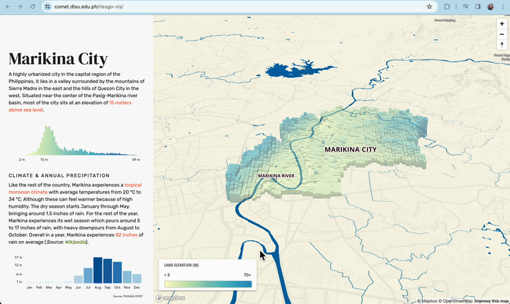
Project 1: Marikina Flood-Risk Visualization
Link:
Preview:
What is it:
- This is a project by Briane Paul V. Samson from Future University Hakodate & De La Salle University and Unisse C. Chua from De La Salle University. I came to know about this project in Dec 2019 during Ms. Chua's presentation on Data Science and Data Communication, emphasizing the importance of sharing your reserach findings and the data that you gathered in ways that are consumable to the public.
What I like about it:
- Illustrated information on an area in different aspects (Climate and Annual Precipitation, Population, Evacuation Areas, Ideal Coverage, Estimated Coverage, Accessibility, Suitability).
- Interactive, 3D maps, scrollytelling!
Other thoughts:
- The storytelling format isn't applicable on a national scale, at least not yet—we'll need to coordinate with the different and specific local government units to achieve what Ms Chua and Mr. Samson did with their project, an endeavor we don't have the capacity to perform at the moment
Project 2: May Pasok Ba
Link:
Preview:
What is it:
- “May Pasok Ba” literally just asks if there's school or work today, in the context of typhoon suspensions or national holidays
What I like about it:
- Simple and straightforward answer. Sometimes news articles tend to bloat the info with the speed of wind and direction, instead of answering the question directly on whether there's classes or work during the day
Other thoughts:
- Too simple, doesn't always cite sources, doesn't necessarily cover the entire Philippines
Project 3: USGS TopoView
Link:
Preview:
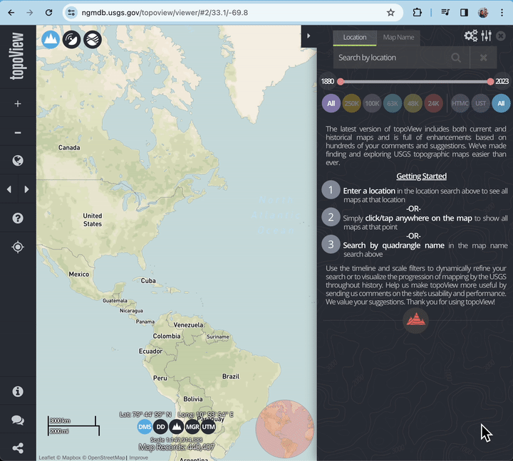
What is it:
- TopoView shows the many and varied topographic maps of areas through history. This can be particularly useful for historical purposes, such as finding the names of natural and cultural features that have changed over time.
What I like about it:
- Beautiful, on-brand, and intuitive interface
- Complex controls while maintaining mobile-responsive design
The key item that I personally liked in these project is how usable they are and how effective they deliver information visually and interactively. This is what inspired me the most in designing the other features of the app, which I'll discuss in the next section.
4 - The Dance Between Design and Tech
Given the goals of the project, target user segments, and some design inspirations, I came up with the following design ideas:
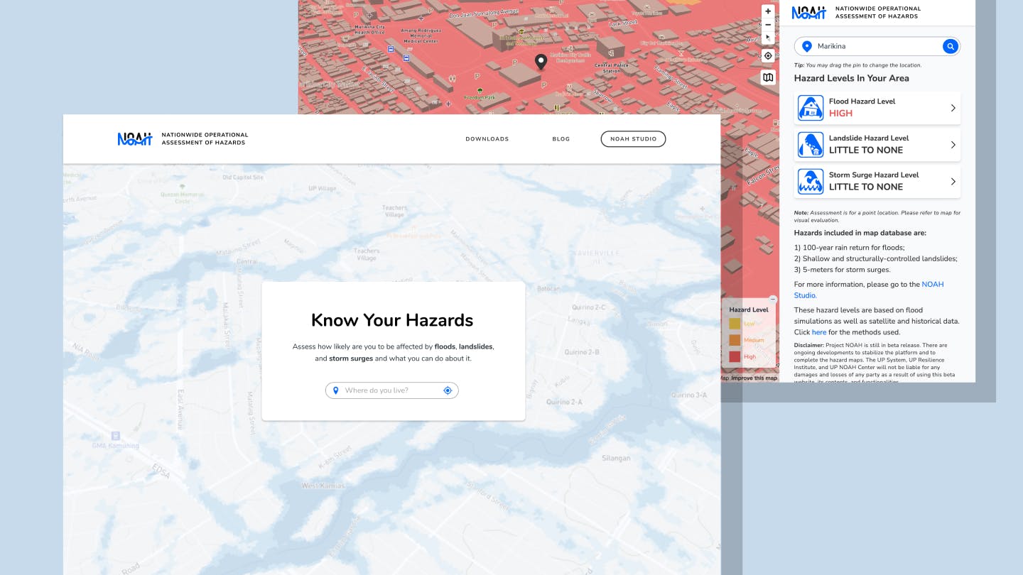
Design Idea 1: Know Your Hazard
The idea is for a user to only share their location for them to be know the hazards in their area, whether that's flood, landslides, and storm surges. They don't need to know the technicalities under it and how it was determined. They just need to informed of the hazards in their area so they can prepare accordingly.
Going back to the plane analogy, they just need a “ride” to get to their destination as opposed to learning the inner workings of a car.
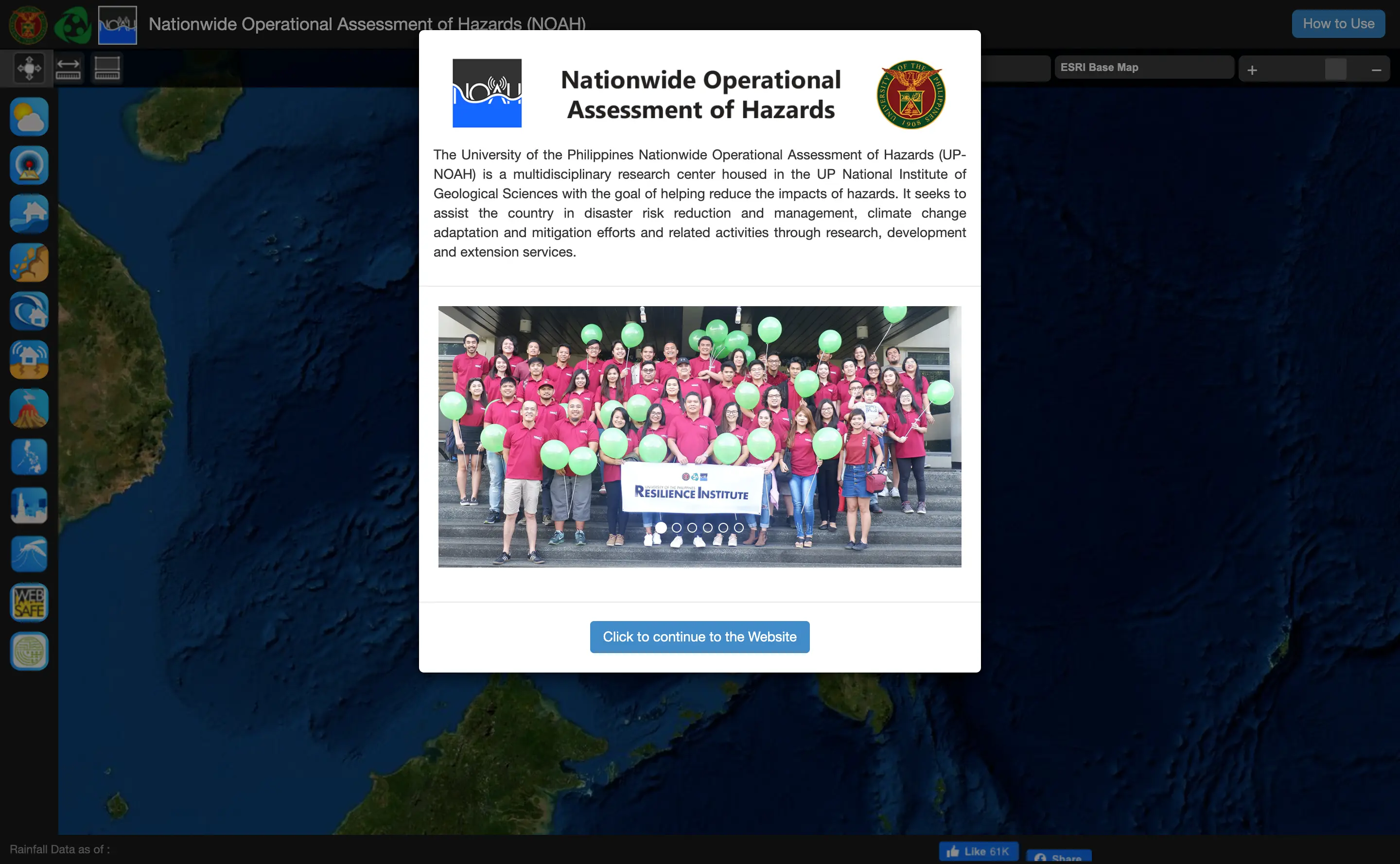
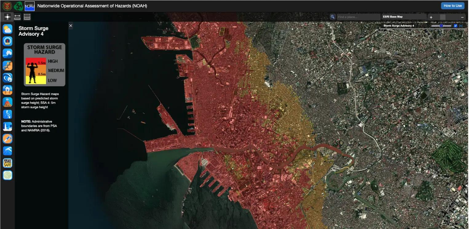
Design Idea 2: NOAH Studio
For the technical users, I wanted them to have a “playground” through which they could use all the hazard maps that we have and super-impose them on top of one another. These users have specialized knowledge on hazards and disaster risk and reduction such as our policy makers, urban planners, mayors, and GIS researchers. They should be given as much control on how they want to view data as they see fit. For this segment of users, I give them the “NOAH Playground”. (We later renamed it to “NOAH Studio“ since “Playground” sounded too jovial for a product that directly deals with life and death scenarios. 👀)
The Challenge
Before I could create detailed mock-ups of these features, I wanted to first confirm how feasible are they and how costly would it be to make them possible. Honestly, I got into some sort of deadlock during the design phase because although I had an idea of what I wanted our users to experience, I could not go into the details of how the interface would look like unless I already knew what was possible in the first place.
To translate the design ideas above, we needed answers to these questions:
- Given a pair of coordinates, how can we determine the hazards in the area?
- Given the whole map of the Philippines, how can we view all the hazards at the same time?
- Given GeoServer and the user's coordinates (and not the bounding box), can we determine a single hazard level in their area?
- Can we determine ALL of the hazards in an area at the same time (regardless of type), in one query? At what cost? (This was a major design concern. If we it takes a while to query all hazards within a certain radius of user's coordinates, might as well design the user experience such that they will only view one hazard at a time and walk them through the hazards similar to how Marikina Flood-Risk Visualization communicated their data.)
- What other alternatives do we have to GeoServer? Why were we using it?
- Geo-tagged PNG files must have been in another form before it was rasterized as a PNG file and served by GeoServer. What was the format of the data before they were PNG files?
- If NOAH's web app displays the hazard levels as geo-tagged PNG files that are colored 0, 1, and 2, is it possible to change the colors IN THE BROWSER?
These questions belong to the first batch of questions that later on spawned more follow-up questions and answers, all which I've drawn in the following mindmap:
Feel free to hit me up if you want me to go over all the technical details included in the mindmap above, but I'll just summarize what happened next:
- After exploring possibilities with GeoServer and hitting a wall so costly to handle, we deemed it best to use Mapbox for storing and displaying our geospatial data. We wanted to stay focused on the main goal of the revamp, which is to communicate the data we already have, instead of recreating and maintaining the wheel. It was more costly to do it ourselves than to pay and use an existing platform that specializes on the functionalities we wanted.
- We've uploaded our shapefiles in Mapbox and we started rendering the hazard maps as vector tilesets in the browser, making it possible to customize their colors and transparency on the fly.
- Prince and Dianne of the backend team did a great job at processing the shapefiles to make it “lighter” on the UI to render them at the same time, allowing us to render hazard maps that cover the entire country without waiting for a whole minute to load. You may view their scripts at https://github.com/UPRI-NOAH/mapbox-processor
- We entered a partnership program with Mapbox. Since then, they have forgiven our 💸 bills 💸 and featured NOAH on their blog 🙏🏽
- For the Know-Your-Hazard feature, in the end we were able to evaluate the levels of ALL the hazards (floods, landslides, and storm surges) within a 50-meter radius of a user's coordinate.
- For the NOAH Studio, we were able to showcase all of the hazards in an area and give the user granular control on which hazards and critical facilities to view as well as their color and transparency. If you're wondering about the state management of the app, this was heavily reliant on RxJS.
You may view the frontend code at https://github.com/UPRI-NOAH/noah-frontend.
5 - Results and Outcome
Six months after its launch, the revamped NOAH website have reached nearly two million sessions through organic traffic:
As featured in:
6 - Wishlist💫
Here are other features and improvements that I think would be great to be included in the web app or created as spinoffs:
- Translations (we have roughly 180 live languages)
- Update shapefiles (these were from 2012; the Philippine landscape must have changed since then); Higher resolution
- Cover missing areas — there were areas that were not completed for the hazard maps of different “levels”
- Evacuation centers to be clearly identified and in real-time. The “Critical Facilities” featured in the current iteration of the website CAN be evacuation centers but aren't ALWAYS assigned as facilities for evacuation.
Note that these are my personal sentiments and do not represent UP and UPRI - NOAH.